sunacme erasable pens
- ajumbleofhappy
- Oct 20, 2023
- 2 min read

I was perusing Amazon one day when I found a set of erasable pens. My mind was blown. I love using pens, but occasionally, I make an unfortunate mistake. Knowing there was a pen out there that could possibly be erased was a dream come true, so of course I added them to my cart and waited.
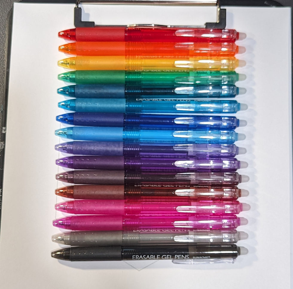
The barrels of these pens are a very pretty color, and I was eager to jump in and test them out. As I started my doodles, I noticed that the colors were not as bold as I expected. They are not pastel, but just a light version of the color. The dark green was not what I expected, and the two purples and two pinks ended up looking very similar. The bronze and the brown were interesting, not in a bad way, but because they aren’t your typical color options. I liked the grey, but the black appeared more grey than black.

This pack of pens included 16 colors. For the paperage collection, I broke it into two sets (link part 1 and part 2), but looking back, I wish I hadn’t done that. I thought if I double-upped the colors on each line of the hexagon, that would take 12, leaving four for the words in the middle. With that thought in mind, I figured I would keep the rainbow hexagon theme. While the blues and greens have very different shades, the purples and pinks still look similar when more ink is used. One purple is more blue and one pink is more purple, but they are all still wonderful colors.
That left brown, bronze, black, and grey for the words. I didn’t like the brown color, so I used that for the "of". To keep some distance between like colors, I used bronze for the “ajh”. I’m happy I made that choice because the bronze is prettier in my eye. I went with black for the "umble" and grey for the "appy." When using more ink, I felt the black looked more like black and less grey, but the grey was a gorgeous color.

These pens look to be somewhat streaky when using them to color. I can tell that wasn’t their main purples of creation, however, the shade of the colors is very nice. They aren’t in your face so if you are trying to write a list of to-dos, it's easier on the eyes. I didn’t show it, but of course, I tried the erasable part, and it was almost like magic. I wasn’t expecting it to work so well, but these are a great option for notes or lists.
Pens Used:
sunacme Erasable Gel Pens, Retractable Clicker Fine Point Gel Pen, Assorted Erasable Pens for Drawing Writing Planner Note, 16 Colors
View these pens on Amazon: https://amzn.to/3LBpnGa


Comments